|
What is a
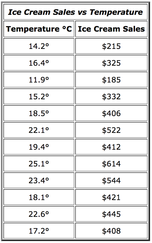
Scatter Plot? A scatterplot is when you take the values two different variables and make them into one coordinate point. For example, if if the temperature is 14.2 out (in Celcius), I sold $215 worth of ice cream. That point would be (14.2, 215). If it warmed up to 16.4, then I sold $325. So that point is (16.4, 325).
|
For ExampleThese values 
|
|
Are the points you see on this graph

|
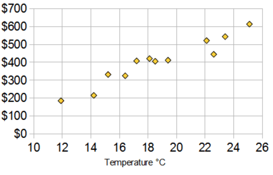
Notice the furthest point to the left. The point (11.9, 185) represents the values from the third line of the table, where you sold $185 worth of ice cream when the temperature was 11.9 degrees Celcius.
|
|
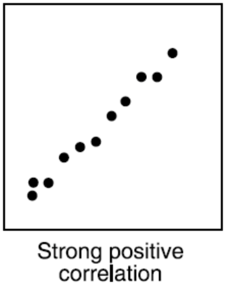
Strong positive correlation means that as one variable increases in value, the other increases at almost the exact same rate. It means the points are very close to making a straight line.
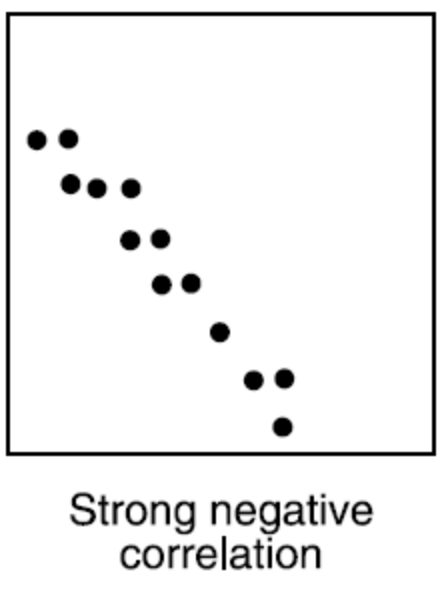
Think of it like driving on a highway: you are not always going to the same speed, but you are usually pretty close. _________________ Strong negative correlation means that as one variable increases, the other decreases at an almost exact rate, pretty close to a straight line.
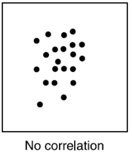
Think of songs on your iPod - the more you put on, the less space you have left. But not every song is the exact same size. But they are close. __________________ No Correlation means exactly there - there is no relationship between the two variables. They don't match. Once can go up and the other one down, up or stay the same.
Think of relating height to time sleeping, or maybe age to number of friends. They are not related at all. |
|

Positive Correlation:
As one goes up, the other goes up 
Negative Correlation:
As one goes up, the other goes down |
|
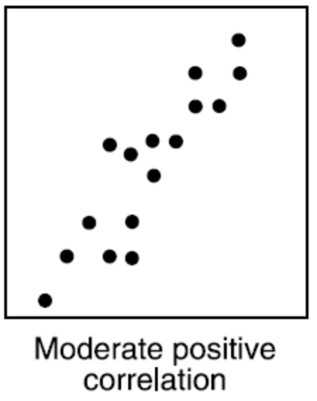
Moderate positive correlation means that as one variable increases in value, the other does increase but not quite at the same rate. It does go up, but the relationship is not really exact, rather it is more "in general."
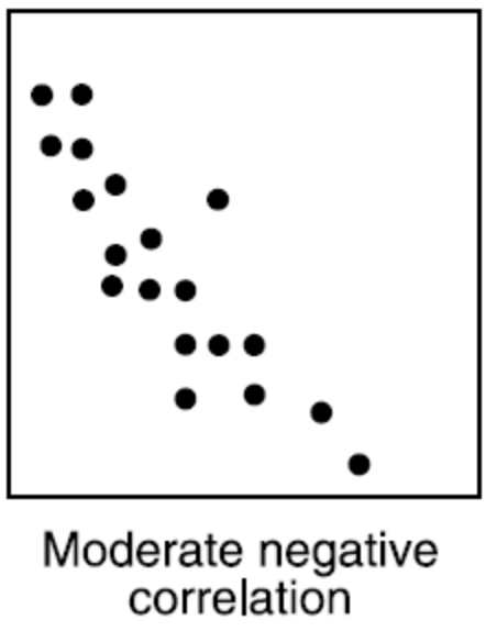
Think of this like waiting tables - the more people eat, the more a server makes as a tip, but the relationship is not exact. _____________________ Moderate negative correlation means that as one variable increases the other decreases but not quite at a linear rate.
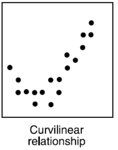
Think of this like downloading apps to an iPod. While songs are all around the same size and length, apps are not. Some are big, some small. The more apps you download, the less space you have. But the rate changes a lot. _____________________ Curvilinear is a fancy way of saying the dots don't make a line, they make a curve to them. This means that the values go down a bit, then change and go up for a while.
To think of this, think about people backing up a car and then going forward. We all do it at different speeds and rates, and this would be the graph. |
Learnzillion has a series of 5 videos that help to explain everything about this standard. Watch them in order to review all the concepts we just talked about above.
|
Video 1
|
Video 2
|
